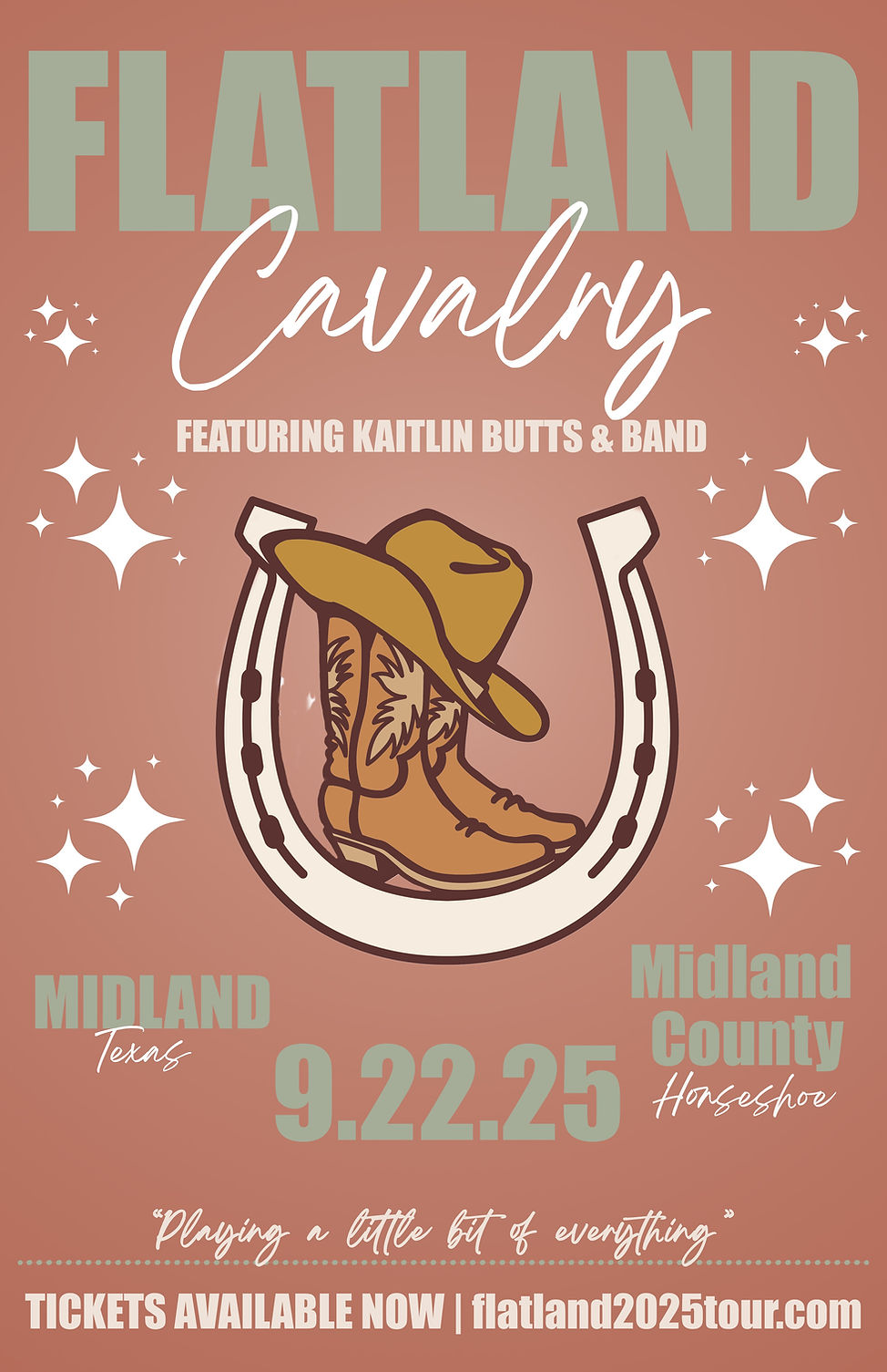
Concert Poster Design
For this mock concert poster, I wanted to visually express the warmth, comfort, and easygoing energy that define Flatland Cavalry’s music. Using Adobe Photoshop, I built the design around a warm orange gradient background to create a sense of softness and familiarity, while pairing it with white, taupe, and sage green typography to reinforce a calm, relaxed tone. These colors were intentionally chosen to mirror the band’s inviting sound and to give the poster an approachable, Western-inspired atmosphere. The illustration of the horseshoe, cowboy boots, and hat further emphasizes the band’s roots and helps ground the design in a recognizable country aesthetic.
Typography played a key role in establishing visual hierarchy. I used a bold, easy-to-read serif font for the most important details ensuring they stand out at first glance. For supporting information, I selected a softer, script-style font that adds personality while still maintaining clarity through bright white lettering. This balance keeps the poster readable while enhancing its overall tone. I also chose a centered layout and circular gradient to guide the viewer’s attention toward the focal imagery and create a cohesive, eye-catching composition. Through these stylistic choices, the poster aims to feel both polished and inviting, just like Flatland Cavalry’s music.